


Customizing Rhino toolbar button icons


After writing hundreds of lines of a code that executes a sophisticated operation in Rhino through a single click of a button, it would be nice to have a cool icon to go with it. This post highlights a few good web sources that provide general information and tips for customizing toolbar button icons in Rhino. Also included in the post is a short tutorial on how to create an icon from Adobe Illustrator.
Web sources
- Rhino help : general information on Rhino toolbar styles, sizes and properties.
- McNeel Wiki : thorough explanation on Rhino toolbar button icons
- Microsoft Developer Network : general information and tips for creating Windows icons (for Windows XP, but still valid tips)
- Raster image of Grasshopper component icons (via David Rutten from here).
General tips and info on Rhino toolbar button icons
- There are three ways to change/create custom button icons:
- Using built-in Rhino pixel editor – This option does not require any extra software, but the built in pixel editor is a more dumbed-down version of MS Paint with extremely limited drawing functions. It could be used for minor refinements and tweaks, but is not ideal for creating new icons from scratch.
- Using an external pixel editing software – This option is the “Photoshop” approach, where the icon is created as an image by modifying, adding layers of anti-aliased images, incorporating filters, etc., then saving it as a PNG image with all the layers flattened while keeping the alpha channel.
- Using an external vector drawing software – This option is ideal for creating icons from scratch using vector drawing software like Illustrator. The vector drawing can be exported as a PNG image and imported “to fit” from Rhino.
- Use full alpha-channeled PNG format for all images (so four channels in total: RGBA, not just RGB – automatically done when exporting from Illustrator); the alpha channel controls the level of transparency per pixel, and therefore creates a smooth gradient from fully-opaque to fully-transparent.
- For clean anti-aliasing, align shapes to the pixel grid whenever possible.
- In Rhino, default button size is “medium”, which is 24×24 pixels (“small” = 16×16 pixels, “large” = 32×32 pixels) → create icons based on 24×24 pixel grid.
- Use default Rhino icons in vector format, or raster images as the base to stay somewhat consistent with Rhino’s visual conventions.
Additional tips from McNeel Wiki:
- All lines in icons should be a whole number of pixels thick (the default set only contains 1 and 2 pixel lines).
- White (or other bright) lines should be at least 2 pixels thick.
- Try not to use the pixels along the edges of the icon (this leaves an active icon size of 22×22 pixels.).
- Try to use the same view projection as the standard Box function button icon.
- Avoid near-vertical and near-horizontal lines.
- Avoid using texts in icons (this clashes with localization).
- Use outlines for areas next to the transparent background.
- Use the colors in the default palette.
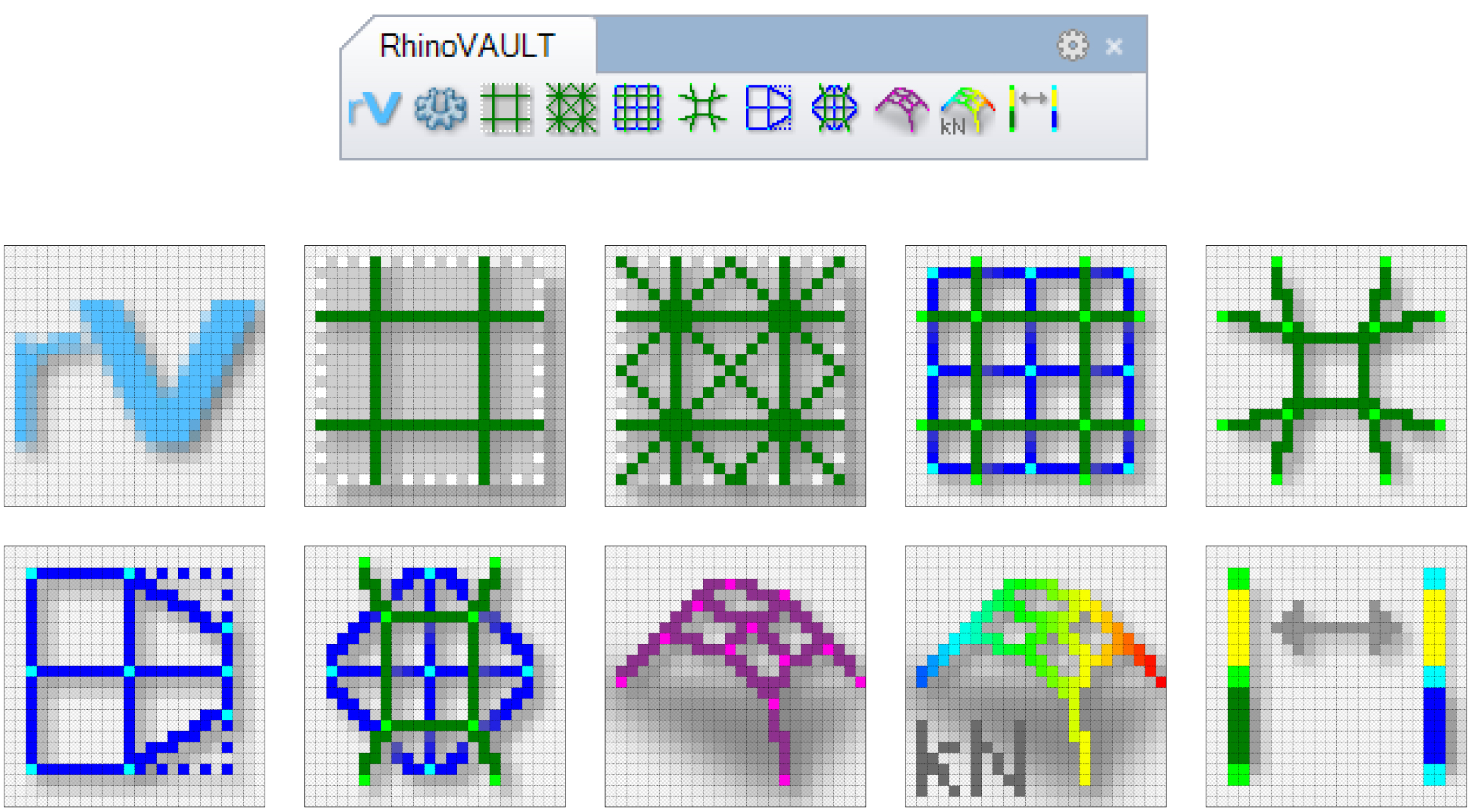
Example: RhinoVAULT
RhinoVAULT is a good example where the general guidelines outlined above are (notably the pixel alignment, contrast of color, and edge offset) incorporated well to generate clear, easy to read icons ( from version 1.3.0.1).
Illustrator tutorial
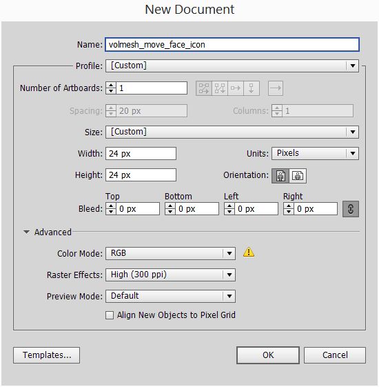
This simple tutorial explains how to generate PNG icon images from Adobe Illustrator, for a script that moves a face of a solid Rhino object while maintaining its face orientation and the existing neighbor edge orientations.
Step 1: Opening a new Illustrator file
- Start a new file with an artboard that is 24×24 pixels, RGB color mode, Raster Effects at 300dpi (only affects on-screen dpi), and set “Align New Objects to Pixel Grid” to off (this can be changed later per individual objects).
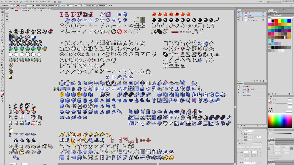
Step 2: Choose, mix-and-match base object (or start from scratch)
- Tried-and-true, these vector drawings of the standard Rhino toolbar button icons are a good place to start brainstorming and mix-and-matching (link to the AI file download above).
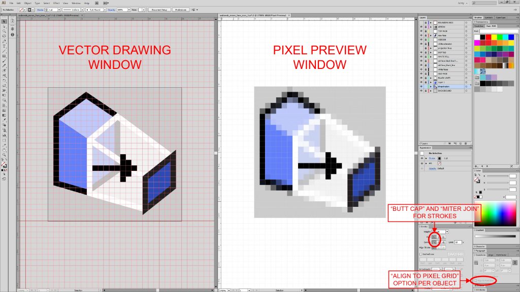
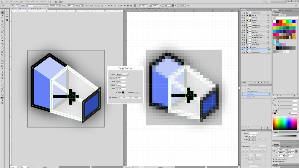
Step 3: Drawing in Illustrator
- Set the gridline for every 24 pixels with 24 subdivisions, “Grids in Back” option off, and “Show Pixel Grid (Above 600% Zoom) option on (Edit > Preferences > Guides & Grid).
- By opening another window (Window > New Window) of the same file, you can set the view mode of that duplicate window to “Pixel Preview” mode (View > Pixel Preview, or Alt+Ctrl+Y) and see the pixelated preview of the vector drawing in real time. “Actual Size” mode (View > Actual Size, or Ctrl+1) will show the pixelated image in its true 24×24 size, as it would appear on the Rhino toolbar.
- Align main vertical and horizontal lines to the pixel grid. Each object can be snapped to pixels independently from one another (Transform > Align to Pixel Grid). This option can be turned on/off at any time. This is a convenient tool that automatically adjusts vector geometries to neatly fit into the pixel grid.
- Using these pixel-aligned objects as guides, the other geometries can be snapped onto these elements and drawn with more conventional “Smart Guides” (View > Smart Guides, or Ctrl+U).
- In general, “butt cap” and “miter join” options for strokes result in crisp corners.
- Additional effects and filters can be used to enhance the drawing. For example, “Drop Shadow” is an effective way to make thin line objects pop. Select the object to apply “Drop Shadow” (Effect > Stylze > Drop Shadow) effect to, then adjust effect settings, which can be changed at any time. Setting the offset values to 0 pixels, and blur value to 1 or 2 pixels (or in 0.5 pixel increments), you can get a nice glowing effect.
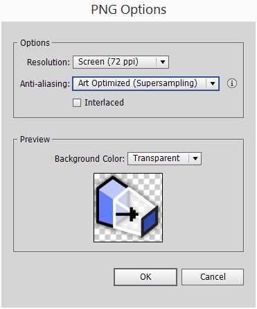
Step 4: Export PNG
- File > Export, pick a file name and a directory, “Save as type” PNG, then click on “Use Artboards” and “Range” to 1.
- 72 ppi is sufficient, as too high of ppi causes unpredictable downsampling by Rhino when importing (explained further in Step 5).
- Set anti-aliasing option to “Art Optimized.”
- “Interlaced” option is not applicable here, since it is used for displaying low-resolution versions of the PNG image when being downloaded in a browser.
Step 5: Import in Rhino
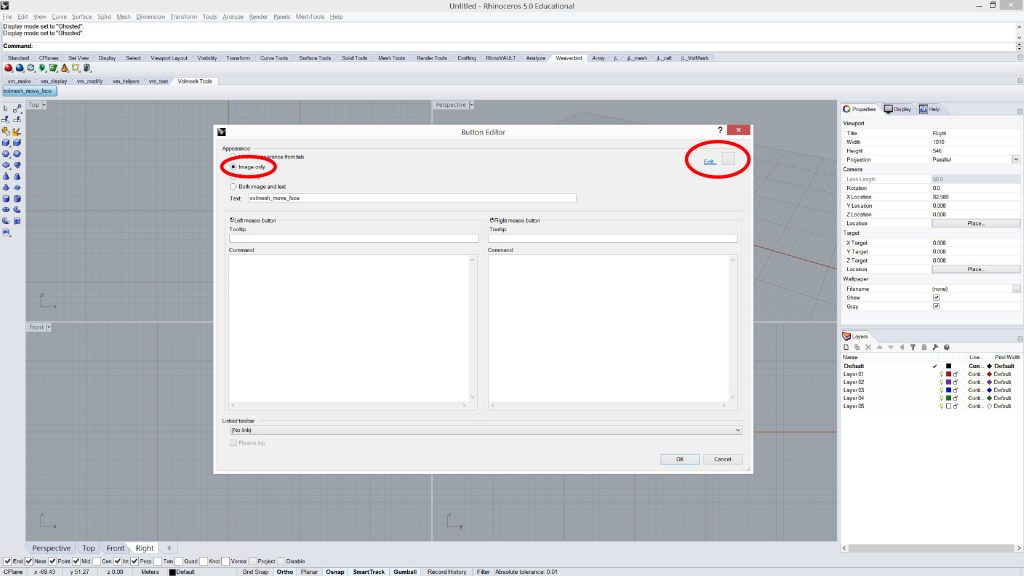
- After a toolbar button has been created in Rhino, open the “Button Editor” by Shift+Right-Mouse-Clicking on the button.
- Set Appearance to “Image Only,” then click on the “Edit….” button on the top right side of the window.
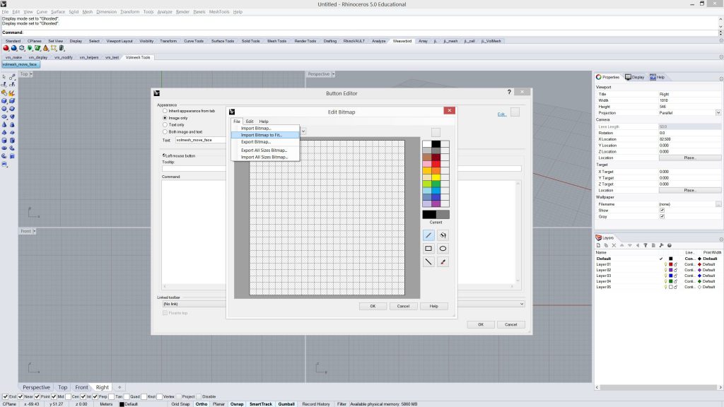
- In the “Edit Bitmap” window, go to File > Import Bitmap to Fit. Then select the PNG image that was exported from Illustrator. Do this for all sizes (16×16, 24×24, and 32×32), so that icon appears when the toolbar button display size is changed. Unfortunately, since the icon itself was created in a 24×24 grid, it will not scale perfectly well for 16×16 or 32×32. Although, different PNGs can be drawn and imported for each one.
- After this importing process, pixels of the image can be modified and refined with the built in editing tools, if needed.
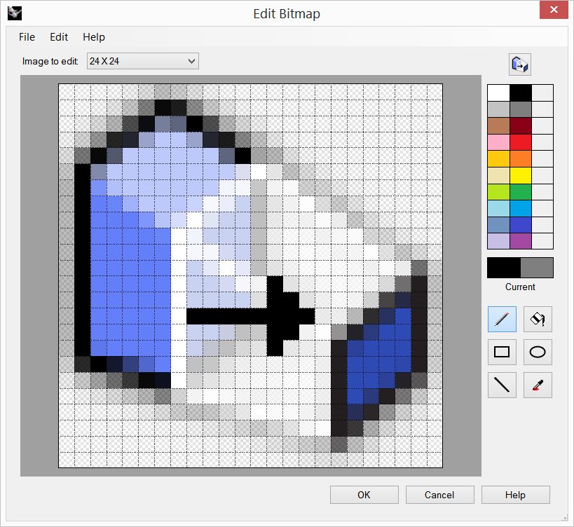
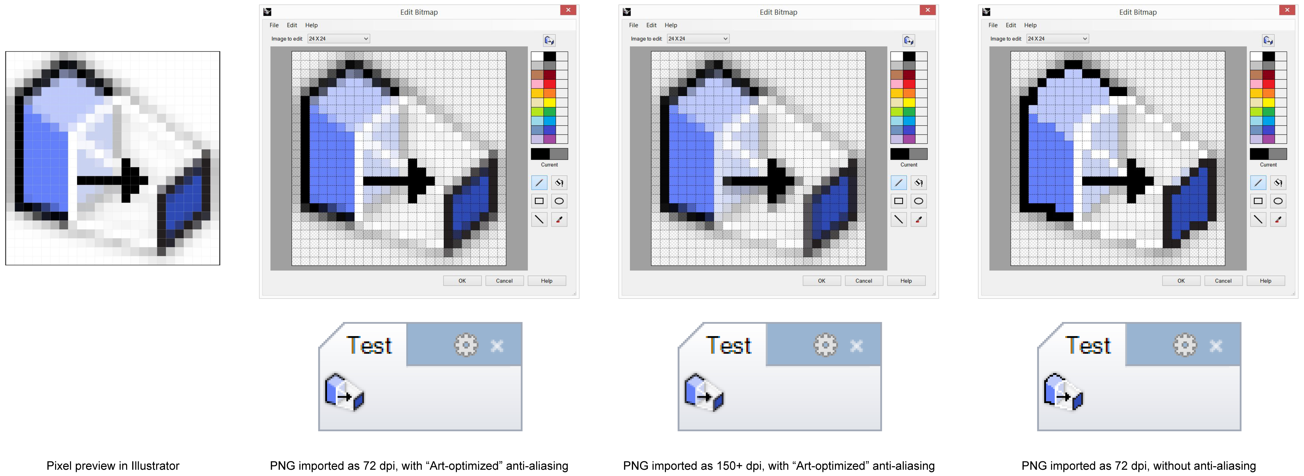
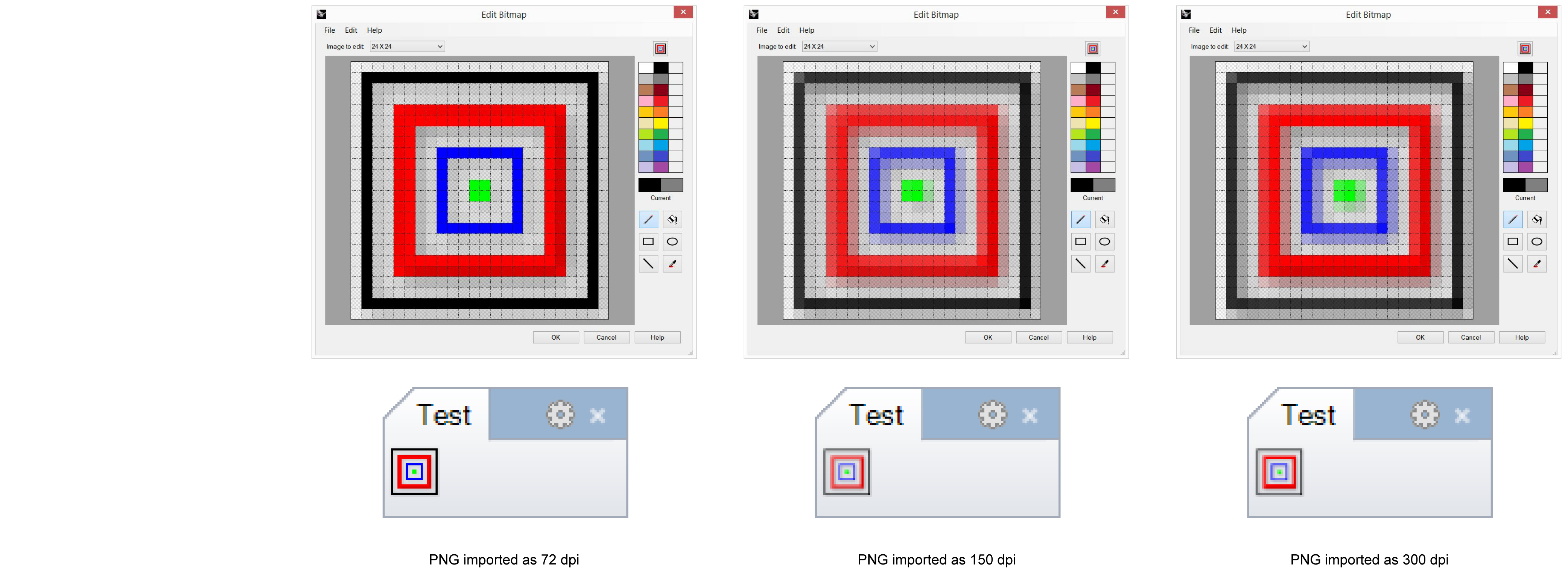
Result of importing PNG with 72ppi.
- Because the PNG was designed and drawn with exact actual-pixel-resolution output in mind, exporting from Illustrator without any downsampling would be ideal. However, the output resolution in Illustrator is based on ppi (pixels per inch, which is not very useful), which cannot be changed. The lowest ppi that Illustrator allows is 72 ppi. 72 ppi seems to work well, and imports nicely in Rhino (see image above). Increasing the ppi of the output PNG image actually decreases the visual quality of the imported image (see the 150+ ppi version in the first example, where the arrowhead and some edges become fuzzy) even for a very simple orthogonal icon (second example below). Click on the images for high-resolution view.
- No anti-aliasing produces the most “crisp” image, but it loses smoothness for oblique lines.
There are hundreds of plugins for Rhino available at food4Rhino, all with beautiful icons which can all be opened, accessed and referenced for your icon creating needs.
Happy icon-ing!